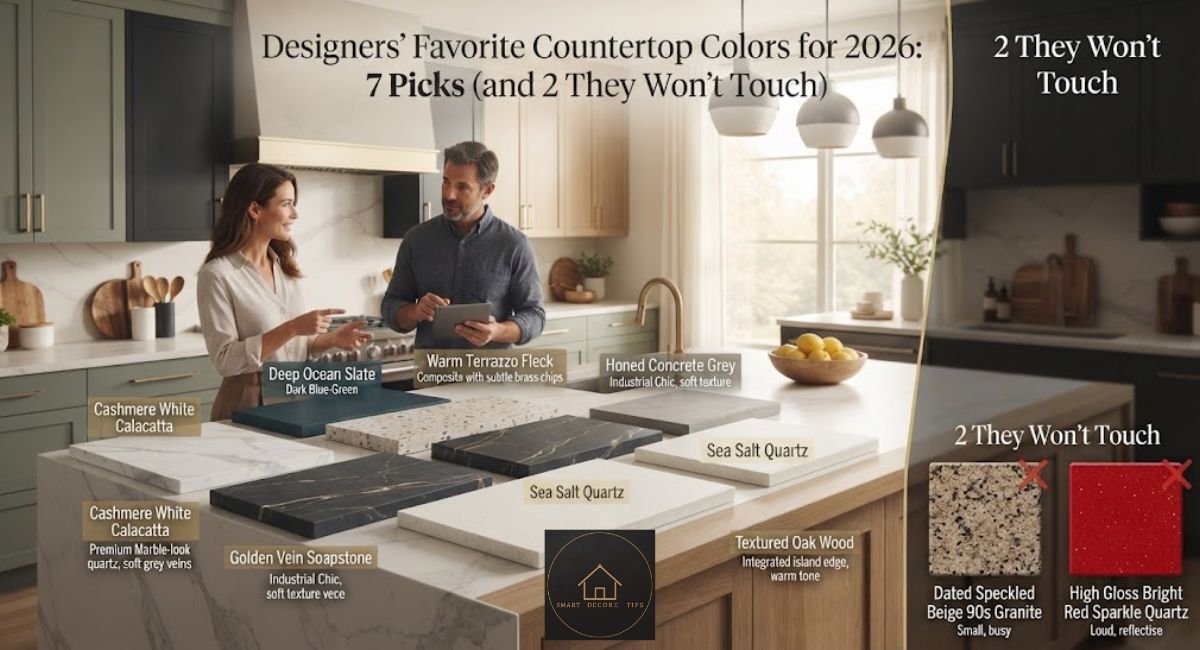
Designers’ Favorite Countertop Colors for 2026: 7 Picks (and 2 They Won’t Touch)
Ask three interior designers what countertop color they’d pick for their own kitchen, and you’ll get three answers that all somehow avoid the word “white.” That’s not an accident. Designers favorite countertop colors right now lean into warm, natural, slightly imperfect tones: black, blue-gray quartzite, creamy beige with visible movement, and earthy greens. Meanwhile, the flat, cool-gray quartz that dominated the last decade is quietly getting phased out of new projects.
Quick answer: Designers’ favorite countertop colors for 2026 are black, blue-gray, creamy beige (especially Taj Mahal-style quartzite), and earthy green, chosen for how well they hide daily wear and pair with mixed cabinet colors. The colors losing favor are stark white and cool “icy” gray, which designers now describe as feeling clinical rather than clean.
I’ve spent the past few years pulling sample boards for my own kitchen remodel and for a few friends’ projects, and the pattern below matches what I saw in showrooms, not just what’s trending on design blogs.
Quick Takeaways
- Black and charcoal remain the single most requested “safe drama” color, working with almost any cabinet.
- Blue-gray and earthy green quartzite are the two colors most designers call “surprisingly practical,” not just trendy.
- Creamy beige (Taj Mahal-style) is the closest thing to a universal, resale-friendly pick.
- Stark white and cool gray are the two colors designers are actively talking clients out of.
- Installed cost has almost nothing to do with which color you pick. It depends on the material and slab grade, not the hue.
What Are Designers’ Favorite Countertop Colors Right Now?
Most designers I’ve seen quoted or spoken with land on one of four families: black, blue-gray, creamy beige, or earthy green. None of them are picking these purely for looks. Black hides coffee rings and knife marks better than almost anything lighter. Blue-gray and green, in the right stone, read as a neutral from across the room but add depth up close, so you get color without committing to a “theme.” Creamy beige, especially in quartzite with soft gray veining, is the one color that shows up in traditional, transitional, and modern kitchens alike, which is exactly why it keeps winning.
There’s a real, if unglamorous, reason white lost its grip: grout lines and seams show every crumb, and it photographs beautifully on day one and shows every splash by week three. I noticed this firsthand comparing a friend’s five-year-old pure white quartz counter against a honed beige quartzite one two doors down. The white one needed a wipe-down mid-conversation; the beige one hid a coffee spill for the length of our visit.
Black Countertops: The Safe Drama
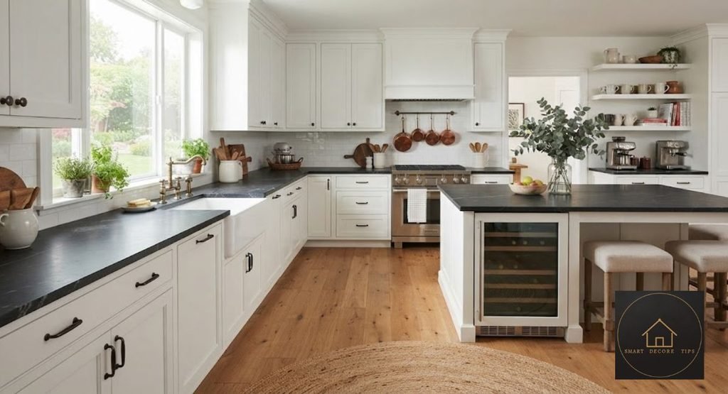
Black is the countertop equivalent of a black turtleneck — it goes with everything and nobody questions it. It works in soapstone, granite, laminate, and quartz, so the price point flexes to fit almost any budget. Pair it with warm wood cabinets and it reads rustic; pair it with matte white cabinets and it reads modern.
Hardware matters more with black counters than with almost any other color on this list. Brass and unlacquered brass hardware warm up a black counter so it doesn’t feel cold or heavy. Matte black or brushed nickel pulls, on the other hand, push the whole kitchen toward a moodier, more industrial look. If you’re mixing metals elsewhere in the kitchen, a black counter is forgiving; it reads as a backdrop rather than competing with your fixtures the way a busier stone would.
The trade-off: dust and water spots show up fast on a glossy black finish, especially near a sink. A honed or leathered black finish hides that far better than polished black. I learned this the hard way after specifying a glossy black sample for a client, then swapping it for honed after one look at fingerprints on the showroom slab. Soapstone, in particular, develops a soft patina over years of use that a lot of homeowners end up preferring to the flatter, more uniform look of black granite or quartz.
Blue-Gray: The Color Designers Won’t Shut Up About
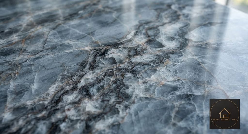
Blue-gray quartzite doesn’t announce itself as “colorful,” which is exactly the point. Designers like Samantha Tosti of Tosti Design point to stones like Azul Do Mar quartzite for clients who want something more distinctive than plain gray without going full statement-piece, while Cielo and Fusion quartzite show up often in the same “subtle blue-gray” conversation for their softer, more muted veining. It pairs with brass, black, and unlacquered brass hardware equally well, and it ages gracefully because the color variation already hides minor etching.
This is also one of the few colors that works equally well as a full slab or as an accent. I’ve seen it used on a kitchen island only, with plain white quartz on the perimeter counters, and the effect reads intentional rather than mismatched, mostly because the blue-gray tone stays close enough to neutral that it doesn’t fight the surrounding cabinetry.
One thing worth knowing before you fall in love with a blue-gray sample: lighting changes it dramatically. A slab that reads cool blue under warm LED showroom lighting can look almost slate-gray under daylight. Always take the sample home and look at it morning and evening before you commit. It’s a step a surprising number of first-time renovators skip.
Creamy Beige and Taj Mahal Quartzite: The Closest Thing to Universal
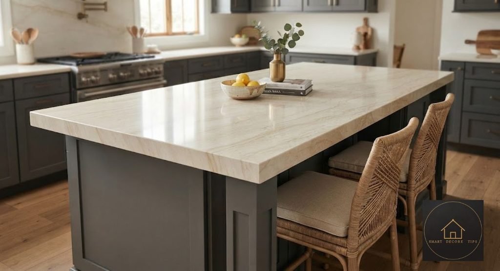
If there’s one countertop color that shows up across every design style, it’s warm beige, and specifically, quartzite sold under names like Taj Mahal. Designer Reanna Channer of Design to Elevate has called it “the chameleon of all countertops,” and after seeing it next to everything from burgundy cabinets to sage green ones, that’s not an exaggeration. Its soft gray undertones let it bridge warm and cool palettes in the same room, which is rare.
It’s not flawless. Because the veining runs subtle rather than dramatic, a low-grade slab can look flat and a little dull instead of rich. Ask to see the actual slab your fabricator plans to cut from, not just a small sample chip — the difference in movement between slabs of the “same” stone name can be significant. It also pairs beautifully with darker cabinetry, since the warm undertones keep a navy or deep green cabinet from feeling too heavy against the counter, something a cooler white quartz can’t do nearly as well.
Earthy Green: The Neutral in Disguise
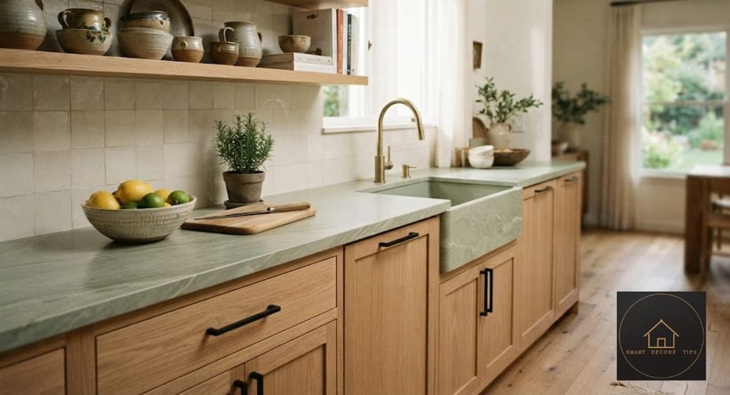
Sage, eucalyptus, and olive-toned quartzite have moved from “bold accent” to something designers now describe as a neutral. Caesarstone’s Ocean Sage engineered quartz and various quartzite slabs marketed under green-toned names show up again and again in 2026 kitchen coverage, and the appeal is consistent: it connects a kitchen to natural wood tones without competing with them. Designer Reanna Channer has specifically called out green quartzite with white veining as pairing well with lighter woods like white oak cabinets, and that combination shows up repeatedly in current kitchen photography for good reason. It softens what could otherwise be a stark, cool space.
Here’s the honest trade-off. Green reads warm and grounded in a kitchen with good natural light and wood accents; in a small, north-facing kitchen with cool-toned cabinets, it can look muddy rather than earthy. I’d test this one with a large sample under your actual kitchen’s light before ordering a slab. Small paint-chip-sized samples genuinely lie about how a big green surface will read.
What Countertop Colors Are Designers Moving Away From?
Two colors keep showing up on the “no longer recommending” side of the same designer interviews: stark, cool-toned white, and icy cool gray. Both were the default from roughly 2012 through the early 2020s, and designers now describe them as feeling sterile rather than clean. Part of it is fatigue. Part of it is genuinely practical: cool white and cool gray show every water spot and don’t hide daily use the way a warmer, textured surface does.
That doesn’t mean white is banned. A warm, flecked white with gold or beige undertones still reads current; it’s specifically the stark, blue-white, glossy version that’s aging fastest in real listing photos.
Designers’ Favorite Countertop Colors by Kitchen Style and Budget
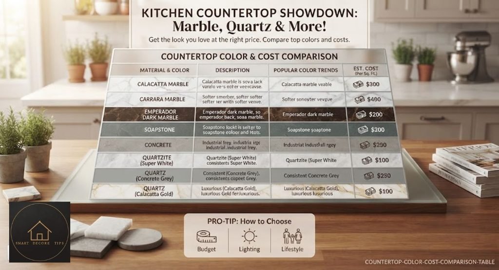
| Color / Material | Best Kitchen Style | Installed Cost Range (2026)* | Everyday Durability |
| Black (soapstone or granite) | Modern, transitional | $40–$100/sq ft | Hides stains well; glossy finish shows fingerprints |
| Blue-gray quartzite | Coastal, transitional, modern | $60–$200/sq ft | Very durable; natural pattern hides minor etching |
| Creamy beige quartzite (Taj Mahal–style) | Traditional, transitional, modern | $60–$200/sq ft | Excellent; soft veining hides daily wear |
| Earthy green (quartz or quartzite) | Organic modern, farmhouse | $55–$150/sq ft | Durable; can look flat in low light on cheap slabs |
| Stark white (engineered quartz) | Minimalist, small spaces | $50–$120/sq ft | Shows water spots and stains fastest of this group |
Cost ranges reflect installed pricing (material, fabrication, and basic installation) compiled from multiple 2026 remodeling pricing guides. Exact pricing varies by region, slab grade, and fabricator. Verified as of September 2026; confirm current numbers with a local fabricator before budgeting. For a full breakdown of how quartz and quartzite actually compare on price and performance, the pillar guide goes deeper than this table can.
How to Actually Test a Countertop Color Before You Commit
Every designer’s advice above assumes you’re looking at more than a paint-chip-sized sample. A full-size sample, or at minimum a foot-square piece, changes how a busy pattern or a subtle color reads. Bring it into your kitchen. Set it on your existing counter or on top of a cardboard mockup. Look at it in the morning, at night under your actual light fixtures, and next to your cabinet door samples, not the showroom’s cabinet display.
Pay attention to the bulb temperature in your kitchen, too. Warm 2700K bulbs push every stone toward yellow and beige, which can make a blue-gray sample look duller than it will under daylight. Cool 4000K bulbs do the opposite, pulling warm beige tones toward gray. If you’re not sure what temperature your fixtures are, a cheap swap to a daylight-balanced bulb for the duration of your sample test will give you a truer read than trusting whatever bulbs came with the house.
If you’re buying remnant pieces to save money rather than a full slab, this step matters even more, since remnant availability in your exact color and pattern can be limited, and you don’t want to fall for a color in showroom lighting that isn’t realistically available in the size your kitchen needs.
So Which Color Should You Actually Pick?
If I had to pick one color for a kitchen I planned to live with for a decade, it’d be the creamy beige quartzite. It’s not the most exciting option on this list, but it’s the one that won’t feel dated in five years and the one that hid the most daily mess in every real kitchen I’ve compared it in. Black is my second pick for anyone who wants more visual drama and doesn’t mind a slightly higher-maintenance glossy finish. I’d steer away from stark white unless you’re genuinely willing to wipe it down constantly — it looks incredible in photos and needs the most upkeep of anything on this list.
If resale value is part of your decision, lean toward the two neutral-reading options: creamy beige or blue-gray. Both photograph well for listing photos and don’t ask a future buyer to share your taste in color the way a bold green or jet-black counter does. That’s not a reason to avoid a color you genuinely love, especially if you plan to be in the house for years, but it’s worth naming honestly if you’re renovating with an eye on eventually selling.
FAQs
Black, blue-gray, creamy beige, and earthy green are the four colors designers mention most often, chosen for how well they hide daily wear.
Creamy beige quartzite, especially stones sold as Taj Mahal-style, is the color most designers describe as safe for resale and unlikely to look dated in five to ten years.
Stark, cool-toned white is losing favor because it shows water spots and stains quickly; warmer white with gold or beige undertones is still considered current.
Colors with visible natural veining or fleck, such as blue-gray or beige quartzite, hide daily marks better than a solid, flat color like stark white or pure black.
Not necessarily — dark countertops paired with light cabinets and good lighting can add depth without shrinking the visual space, while dark-on-dark schemes need extra light sources to avoid feeling closed in.
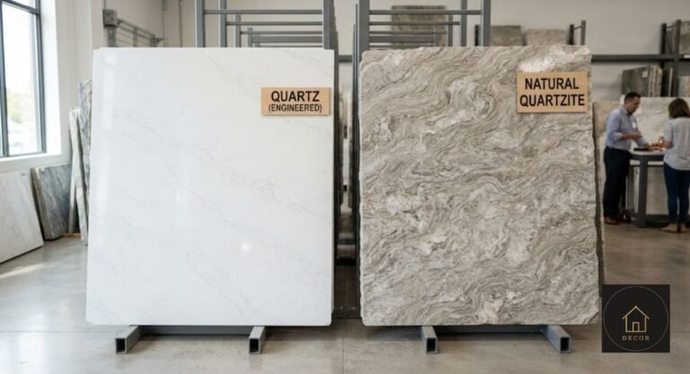
Quartz is engineered and offers more consistent, controllable color; quartzite is natural stone, so color and veining vary slab to slab, which is part of why designers like it for one-of-a-kind looks.

Hi, I’m Shahzad Ahmad welcome to Smart Decore Tips!
I write and research every guide on this site myself, focused on real, practical home decor advice for renters, first-time homeowners, and small-space living. Before publishing anything, I check actual product listings, current prices, and real customer reviews not just what other sites already say.
My goal is simple: help you make smarter, more affordable decor decisions without the guesswork or sales pitch.