Bold Wallpaper in a Powder Room: Pick the Print, Edit the Rest
Bold wallpaper in a powder room works when you treat “bold” as four decisions, not one: how big the pattern is, how dark the color is, what the paper is made of, and how much of the room it covers. The short answer: choose strippable vinyl, match the print’s scale to the room’s light, and keep the vanity, mirror and lighting plain. A powder room is a half bath with a toilet and a sink and no shower, which is why it can carry a print that would wear you out in a living room.
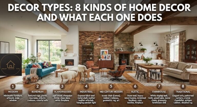
This guide assumes you already want pattern. If you are still choosing between named looks, start with our guide to decor style names and examples and come back.
What makes a powder room the right room for a loud print?
Most visits are short and there is no shower steam, so a loud print reads as a deliberate choice instead of a daily burden. That is my editorial read. The moisture side has a source: Bob Vila’s bathroom wallpaper guide calls wallpaper feasible in a half bath with only a sink and a toilet, and suggests keeping it to one accent wall, far from the tub or shower, in a full bathroom.
Two layout checks matter more than the print itself:
- Sightline. If the powder room door opens onto a hallway or the kitchen, the paper is part of that view. Judge it from the doorway, not from inside.
- Daily use. A powder room off the entry feels like a guest room. One that your household uses all day is a wall you live with. Pick a print you will still like on the fiftieth visit.
Dark papers suit windowless rooms because low light hides fine detail anyway. That is my editorial judgment, not a sourced rule.
What kind of wallpaper is best for a powder room?
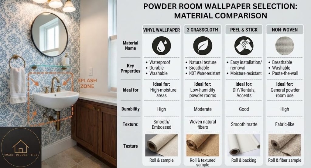
Vinyl is the safest choice. Bob Vila recommends solid vinyl, fabric-backed vinyl or paper-backed vinyl for bathrooms, and says these types can be scrubbed, stripped off later and stand up well to moisture. The same article says traditional cellulose-based paper is not built to handle water droplets and steam.
| Material | What the source says | My note |
| Solid, fabric-backed or paper-backed vinyl | Recommended for bathrooms; scrubbable, strippable, moisture resistant | My default pick for most powder rooms |
| Traditional paper-based (cellulose) | Not designed to handle water droplets and steam | Only away from the sink, if at all (my judgment) |
| Natural textures such as grasscloth | Not covered by the source | Ask the maker whether it is wipeable |
| Peel-and-stick | Not covered by the source | Check the product’s bathroom rating and care notes first |
I have not verified durability claims for natural textures or peel-and-stick, so treat those two rows as questions to ask the manufacturer.
Placement counts as much as material. Bob Vila explains that humidity can weaken the paste, and that failed adhesive shows up as curling at the seams. Its fan and open-door tips are written for bathing, but they are cheap insurance in a powder room too (my adaptation). Keep delicate papers out of direct splash range. The article was published in 2018 and updated in 2020, so product options have changed, but the moisture logic should still hold.
How big should the pattern be in a small powder room?
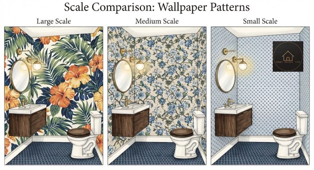
Pick the scale by how much of the pattern you will see at once and by how much light the room gets. Published advice is not uniform: the 2026 trend report covered below lists bold motifs and small-scale all-over prints as current choices, so use the room’s conditions to break the tie. The table is my decision rule, not a sourced standard.
| Your room | Lean toward | Why |
| Windowless, door usually closed | Large motifs, dark or saturated ground | Low light hides detail, so big shapes still read |
| Window or bright hallway light | Medium to large print, mid-tone or light ground | Detail shows, so the pattern can breathe |
| Big mirror, sconces, ornate vanity | Large print in tonal colors | Small busy repeats plus fixtures turn to noise |
| Very little open wall | Print with open space between motifs | Cut-up motifs look accidental |
One trade-off: a large motif can get sliced by a corner or hidden behind the mirror. Check where the repeat lands before you order.
Test the print before you buy. If the retailer sells samples, tape one where you will see it first, then look at it in daylight and under the evening light.
One wall, full wrap or ceiling: how much is enough?
Enough is a full wrap when the room is closed off, and one wall when it opens onto a hallway or you rent. These layout calls are my judgment, not sourced rules.
- One wall behind the vanity. Lowest commitment and least paper. It works when the door opens onto a view of two or three walls and you want the rest calm.
- All four walls. My choice for a dramatic powder room, because a small enclosed room has nowhere to compare against. Partial coverage can look unfinished in a tiny space.
- Walls plus a painted ceiling. Paint the ceiling a color pulled from the paper. It makes the room feel finished without doubling the pattern.
- Walls and ceiling in paper. The most immersive option. It also means the most paper to hang and the most to strip later.
My default for a closed-off powder room is a full wrap with a painted ceiling. I would pick one wall if you rent or may sell soon.
What should stay simple so the room looks expensive?
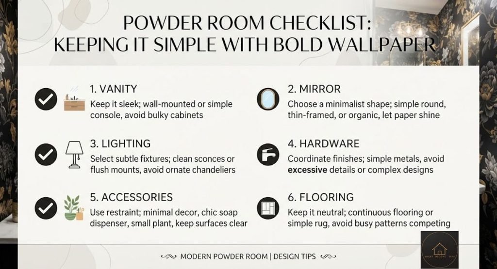
Everything except the paper. “Expensive” is subjective, but restraint is what separates a styled room from a busy one. This checklist is my editorial judgment:
- Plain vanity shape, with no second pattern competing with the wall
- One metal finish across faucet, hardware and light fixtures
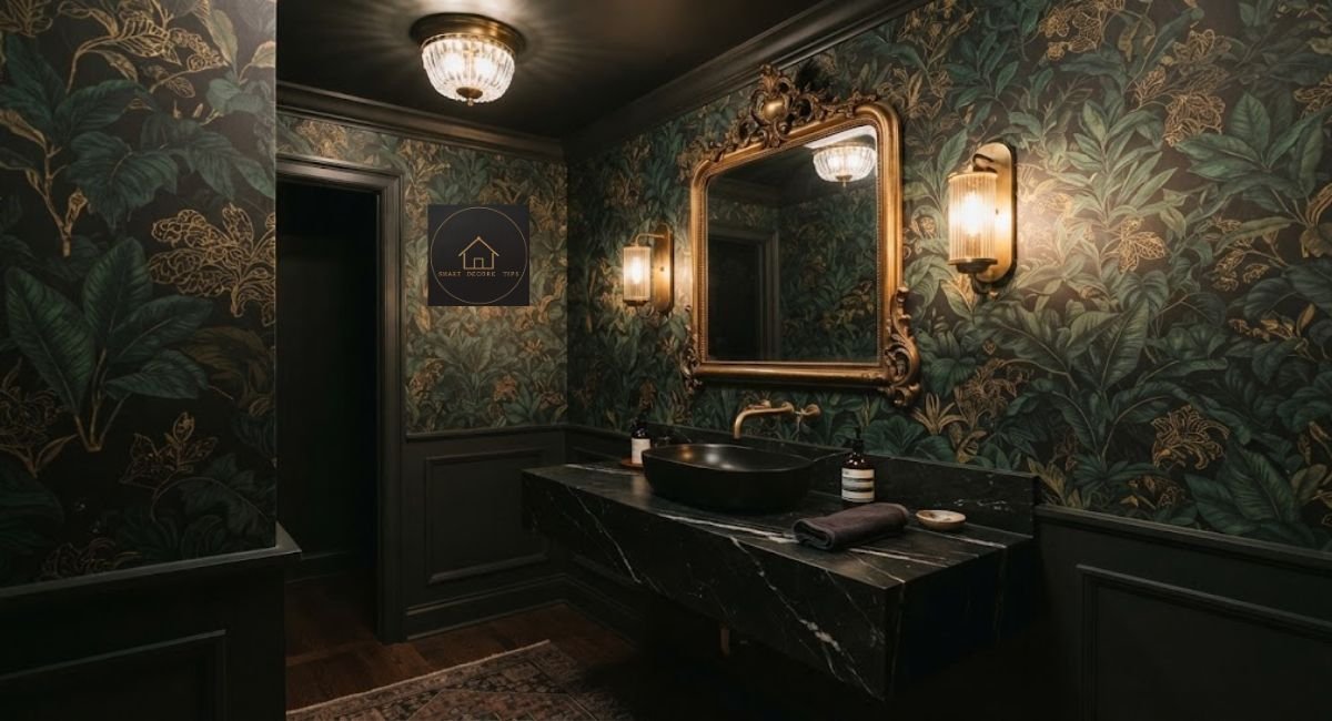
- A mirror shape that suits the print, such as curved for organic motifs or straight-edged for geometric ones
- One light fixture or one matched pair, not three styles
- One color from the paper repeated in a small object like a hand towel or vase
- A calm countertop. A white or lightly veined stone lets the print lead, while heavy marble veining fights it
Mistakes to avoid: a patterned rug or window curtain on top of the paper, mixed metals, and small framed art on a busy wall where it disappears.
What are the bathroom wallpaper trends for 2026?
Calm minimalism leads, and wallpaper is where some designers see bolder touches. That is the framing in Country & Town House’s 2026 bathroom trends report, published January 22, 2026. In it, Sanderson lead designer Rebecca Craig says customers are choosing bold, dramatic bathroom papers such as chinoiserie-inspired motifs, florals and tree-of-life patterns, while stripes and small-scale all-over prints remain classic and scenic papers with animals are strong favorites.
Treat that as one UK magazine quoting one design house, not sales data. For a US reader, the useful takeaway is that a bold powder room can be the one loud room in an otherwise quiet house. If your main rooms follow the pale, soft look in our Nancy Meyers decor style guide, the powder room is where you can break from it on purpose.
When is bold wallpaper the wrong call, and what does a wrong pick cost?
Hold off if your walls have damp problems. Bob Vila advises against wallpapering where there is rising or penetrating damp, since mold behind paper usually shows only when you peel it back. Fix the wall first.
If you rent, check your lease before any adhesive goes up. Removable products exist, but I have not verified how they hold up in humidity, so follow the manufacturer’s care notes. If you plan to sell soon, a bold print is a taste call. I have no data on its effect on resale, and paint is the lower-risk choice.
A wrong pick costs you the paper and the removal time. Bob Vila describes strippable vinyl as designed for easy removal, which makes it the safer type to get wrong.
What I would choose
For most US homeowners: strippable vinyl in a large-scale print, hung on all four walls, with the ceiling painted a color from the paper and everything else kept plain. Go dark and saturated if the room has no window. Stay mid-tone if it has one. Two honest trade-offs:
- Dark rooms read smaller and need good lighting.
- A full wrap is a bigger commitment to remove than one accent wall.
A renter or a minimalist may prefer one wall, a tonal texture or a removable product.
Three questions before you order the roll
- Does the sample still look right from the doorway, with the door open?
- Does it hold up under the room’s evening lighting, not just daylight?
- Does it look good next to your actual countertop and mirror?
Frequently asked questions
Bob Vila’s guide suggests dusting weekly or every other week. For marks, wash gently with a soft sponge and a mild dish soap solution, moving along the seams, then dry with a microfiber cloth. Check the manufacturer’s care notes first.
Bob Vila recommends a mold-proof primer and mold-proof paste for bathrooms, with extra paste near showers. A powder room has no shower, but the same guide ties humidity to peeling seams, so ask your installer.
I cannot give a roll count without your measurements. Measure each wall’s width and height, use the retailer’s calculator, and ask whether the pattern repeat needs extra length. Also ask the retailer how it matches batches if you need more than one order.
Either works, with different results. Painting the trim a color from the paper makes the room feel wrapped. Crisp white trim makes the paper read as a framed panel and keeps busy prints from crowding the edges. That is an editorial judgment.
How this guide was made
I reviewed five competitor pages on October 13, 2026: two wallpaper retailers, two design publications and one design-build firm. I also read search results for the main keyword and related phrases. I opened two sources for the facts in this guide and re-checked both on October 13, 2026: Bob Vila’s bathroom wallpaper article (published July 31, 2018; updated October 1, 2020) and Country & Town House’s 2026 bathroom trends article (published January 22, 2026).
Each recommendation had to follow from those sources or be labeled as my own judgment. I did not test products, decorate a room, use customer reviews, check search rankings or include prices. Limits: the moisture source is older, the trend source is a UK magazine, and I did not verify durability claims for peel-and-stick or natural-texture papers.

Hi, I’m Shahzad Ahmad welcome to Smart Decore Tips!
I write and research every guide on this site myself, focused on real, practical home decor advice for renters, first-time homeowners, and small-space living. Before publishing anything, I check actual product listings, current prices, and real customer reviews not just what other sites already say.
My goal is simple: help you make smarter, more affordable decor decisions without the guesswork or sales pitch.

One Comment